Friday, December 10, 2010
Project Four Process - Collaborative Print Project
Project Three Process - Redefine Media (2D, 3D, Other)
In this project I designed the identity of a National Basketball Association (NBA) expansion team located in Kansas City, Missouri. The target audience for this new NBA team includes all of the sports fans in the area. The design decisions that I made were meant to appeal to the average Kansas City sports fan. Also, I wanted the audience to have a strong connection with the team in terms of its identity. Therefore, I wanted the design of the team to reflect the history of the area and set itself apart from other teams in the NBA. I chose the team name, Sharpshooters, for several reasons. I wanted a team name that reflected the history of Kansas City, yet also possessed the fighting and aggressive sports connotations. Back in the 19th century, Kansas City was known for being a hotspot of famous outlaws, such as Jesse James. In addition to the historical connection with the city itself, a sharpshooter a name often used in basketball to describe a player that has a high shooting percentage or is a prolific scorer. For the logo, I made KC one of the primary visual elements to give the audience something immediately identifiable to latch onto. The other major professional sports teams from Kansas City use KC in their logos, so keeping with this connects the established Kansas City sports fans with this new team. The cowboy bandit logo implies the necessary toughness and cool to appeal to the average sports fan. The simple vector logo feels like a sports logo, which is necessary due to the fact that the colors I used are not typically found in sports teams. I chose variations of brown because of the western feel, but also because of the fact that no other NBA team features brown as a team color. This helps separate the KC Sharpshooters from other NBA teams. I consciously decided to keep the number of team colors to three (a dark brown, a lighter brown, and white) in order to separate this team from the other NBA expansion teams, which tend to have four or five colors. Fewer team colors allow fans to more easily identify the look of their team. Also, the simple color scheme is in line with older, successful NBA franchises like the Los Angeles Lakers and the Boston Celtics, so this was a way of connecting this new team with a feeling of success and history. For the team uniforms, I kept a simple style for the same reasons. I decided not to put the logo on the uniform because I wanted a classier, less branded feel, in keeping with the old West theme. The font on the uniforms was chosen for two reasons. It has an old Western feel, yet it is also similar to the font that was used for a long time by the Kansas Jayhawks on their basketball uniforms. The Kansas Jayhawks are one of the most successful college basketball programs and many of the sports fans in the Kansas City area are fans of the Kansas Jayhawks. Therefore, I liked the subtle connection to another successful local basketball team. I used Kansas City on the front of the uniforms instead of Sharpshooters, because I feel that fans are more attached to the team if the team associates itself more with the city in which it is based. Also, the city name on the uniforms more classic than having the mascot name, which is another way of making this new team seem older and more established. The shape running along the side of the holster mimics the shape of a gun holster, tying in with the team name. The gun pattern featured in the paneling is supposed to resemble a Western paisley pattern. This pattern is also featured on the fan bandanas. The bandanas are meant to be an item that fans would wear to the games, something that would appear intimidating to the opposing team. The bandana also ties in with the one worn by the bandit figure in the logo.
Project Two Process - Editorial Layout
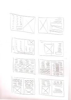
The goal of this project was to take a product, fashion item, gadget, or mode of transportation and develop a narrative around it. From there, we were to design three different magazine layouts: one emphasizing the title of the article, one emphasizing the body copy, and one emphasizing the image. The item I decided to design around was the Swiss Army Knife. I wanted to utilize the Swiss design style in the construction of my layouts. This influenced my decision to use a grid system and san serif fonts.
Thursday, December 9, 2010
Project One Process - Typography/Photography Project
In this project, we were supposed to choose an actual physical public site and then extract and redesign visual elements from that site. The ultimate goal was to create a poster to advertise the changes in the site utilizing photography, typography, or other visual elements. The site I chose was the abandoned fenced area at the end of the 37th Street off campus where I currently live. I wanted to redesign the area into a park where people could gather, get to know one another better, and gain a greater sense of community. Ultimately, the poster design involved a neighborhood picnic at this community park.
Subscribe to:
Comments (Atom)


